
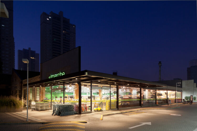
Located in the Southern zone of São Paulo, this unit of St Marche Supermarket chain has Building and Interior projects developed by our team. The construction occupies a street corner site. As a premise, we preserved all existing trees on the surrounding sidewalks and on the lot. The stone wall of the former house that occupied the corner was also preserved and integrated into the project. The outdoor living area were strategically placed among the trees, in the most valued part of the property. Through large openings in the facades, we can see the interior of the store, where a colorful artistic panel, also designed by us, welcomes customers as they enter the store.

First unit of St Marche Supermercados on the coast of São Paulo. Designed within the New Concept, it prioritizes the Perishables areas, with Sushi, Coffee and Pizza services at the store entrance to be tasted on a charming deck open to the busy corner. The Bakery located on the mezzanine floor is all glazed, visually integrating with the store.
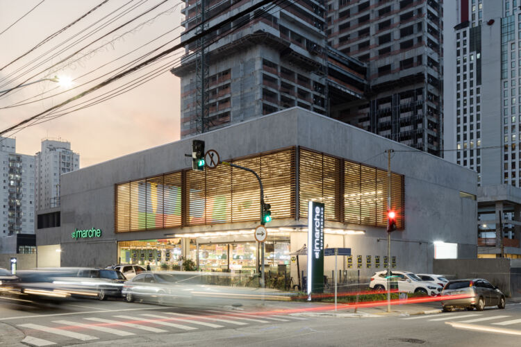
We designed the building and all the interior of this unit, in a highly valued corner, in the East Zone of the city of São Paulo. Through large openings in the facade, we can see inside the store. Outdoor tables installed on a cozy deck facing the street, allow you to enjoy a delicious natural fermented pizza, while integrating the store to its surroundings.
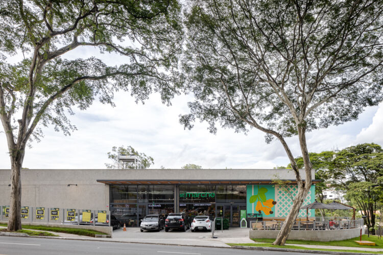
In this new unit located in the neighborhood where the St Marche chain started, we designed the building with the Bubbledeck Modular Constructive System, composed of spheres, trusses, and metallic screens, resulting in a one-piece slab, without apparent beams, with large spans, and certified with the Green Seal. A compact store that besides the pleasant shopping, offers in its access a circular deck, contemplated with an Art Panel, to enjoy a delicious coffee and pizza and the great views to the wooded neighborhood of Morumbi.
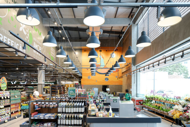
We designed the building and the interior of the store, within the new concept of the Living Room Store. In the center of the store, a large living area is attached to the charming wine cellar. At the entrance, Sushi, Coffee, and Pizza preparations welcome the customer. The entire Visual Communication Project is conceived by espaçonovo, as well as the customized furniture and equipment.

Vila Mascote São Paulo
Building and interior projects, designed to receive a new store of the chain. An inviting store that communicates with the neighborhood, offering not only a pleasant shopping experience, but a large deck open to the street that becomes a meeting point.

First store in the chain located in the interior of São Paulo and located in an important shopping mall in the city. With two access: from the mall and the parking lot, offers a lounging area with cafe, pizza and sushi services and a differentiated wine cellar.
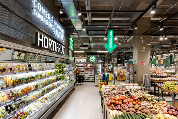
A compact store, located in a neighborhood mall and designed to enable a complete purchase. It is the second store of the chain in this traditional region of the city of São Paulo.
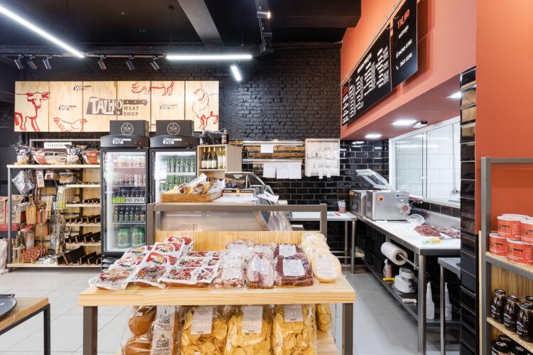
Remodeling and expansion of the chain’s first store within the new concept. To keep the simple, practical and welcoming way of selling meat, the predominant red and black color palette receive pine fronts with pictograms. In addition to Architecture and Brand Identity, the Visual Communications and equipment design are all signed by espaçonovo.

Second store of Empório Santa Maria. Designed with a modern and elegant language, has a central axis connecting the two entrances that works as a pleasant “boulevard”, ensuring the visibility of all sectors. In the store’s center, a circular wine cellar offers an intimate and engaging.

Located in the “heart” of the newest store of Empório Santa Maria and attached to the large circular wine cellar. The Wine Bar serves both the store as the Sushi Bar, marked by the dynamism of the architectural shapes and creates an area of great prominence and sophistication.

Designed within the concept of the chain, this new store, besides the characteristic modernity, has a lounging area in the center of the store and a bakery production on the mezzanine with a large window facing the store.
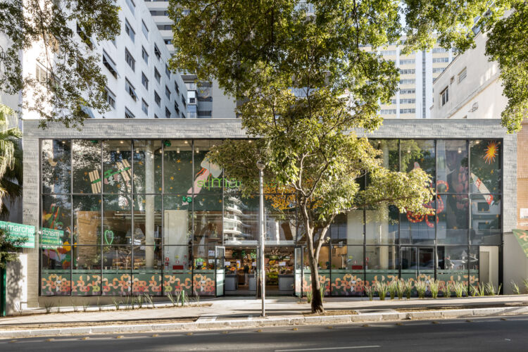
Located in an important avenue of the city, this store highlights the lounging area and wine cellar in the center of the store and introduces an artistic mural of great proportion that, through the glass facade facing the avenue, gifting the city and framing the store.

Designed within the new parameters of the chain, it maintains the casual and modern atmosphere, with great emphasis on service areas and highlight to the wine cellar and lounging area, directly connected to the fresh produce section.

Remodeling project for the espaçonovo office for a in person return after quarantine. Large glass screens were introduced in the meeting room and sample area, integrating these spaces with the open workspace which receives a large and highly visible art panel.

Creation of the new concept of the chain. The introduction of Sushi, Cafe, Pizza and a lounging area with tables for meals, small gatherings and meetings, that gains a cozy atmosphere with a sculptural lighting element and an exclusive design furniture that characterize the space. The curved wine cellar delimits this new space at the center of the store. Distinguished architectural elements mark the different sectors with dynamism.
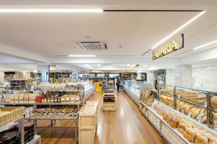
Modernization and expansion of the traditional Emporium, a reference of good gastronomy in the city of São Paulo. The highlight is the new wine cellar with a differentiated design and the bakery, rotisserie and confectionery services with elegant and clean equipment and visual communication.

Located in the mezzanine of Empório Santa Maria, the remodeling project highlights the sushi bar situated in the center of the restaurant with an impactful design. The introduction of a refrigerated wine cellar open to the costumers leaves them free to make their choices.

For the headquarters of Construtora Filippo we designed spaces that would serve both construction and sales team. For the intended casual and elegant atmosphere, we selected a neutral palette with highlights in the brand’s vibrant colors and modern furniture design.

The neighborhood shopping center has the supermarket St Marche as its anchor store and another five smaller shops. A large balcony integrates the commercial area that uses brise-soleil and metallic marquees to enhance the large corner facade.

Indaiatuba
Project for the third store of the supermarket chain, with a commercial gallery and two levels of parking. The new concept enhances de different sectors of the large store, making shopping a pleasant experience.

Novo Portal
Morumbi
São Paulo
Building and interior designed to receive the second generation of the chain’s supermarkets along with a neighborhood shopping center. Keeping the casual characteristic language of the company, we introduced new elements for the sectors, creating not only greater shopping comfort, but also greater visibility and identification for the customer.
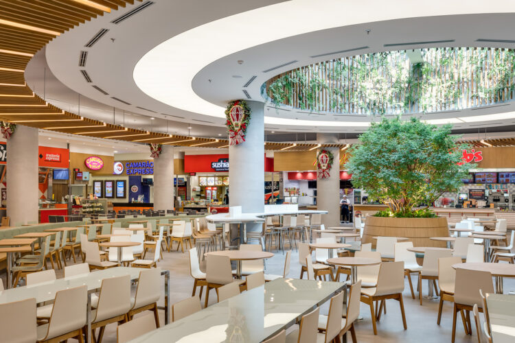
Renovation of the food court. The creation of three environments with their own identities offers greater comfort and different possibilities of use throughout the day. Highlight for the only access of natural light marked with curved lines and a jaboticaba tree as a focal point.

The modernization and expansion of the food court had the introduction of natural light and distinguished pergolas as an important point. Dynamic areas with differentiated table settings did personalize the spaces, according to the various types of operations.
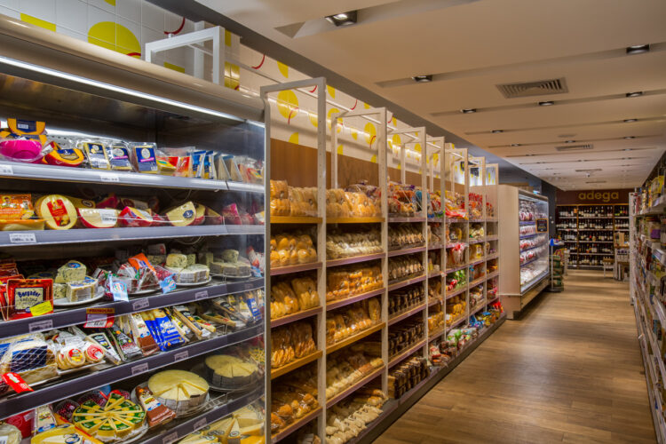
New concept for the chain expansion in the south region of Rio de Janeiro. Modernization of the language and valorization of the Bakery, Fresh Produce and Wine sectors. Graphic elements created from the brand form surfaces of great interest and dynamism.

New concept for Grupo Zaffari’s hypermarket chain. The modernization of the language respected e valued the materials that traditionally characterized the chain. The use of different wooden elements in ceilings creates movement and distinguishes de different sectors of the store. The use of basalt stone in floors and walls is another point of great exclusivity in the chain.
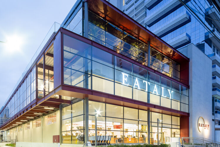
Eataly’s first store in Latin America. For the gastronomic complex dedicated to Italian cuisine, we designed e building with large spans in metallic structure and a central void, integrating the three floors and allowing the visualization of the eight restaurants and market, inviting to the tour and promoting meetings.
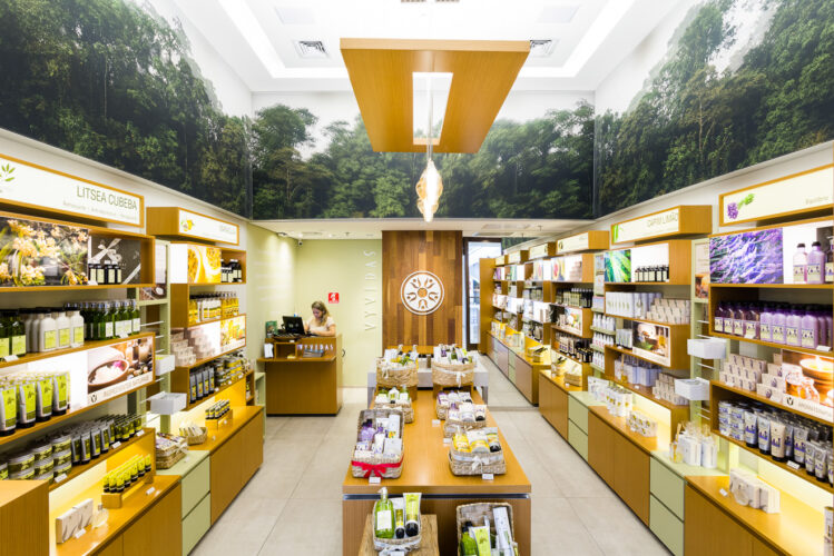
For the natural cosmetics store, we used elements from nature to create an ambience in line with the brand’s philosophy.
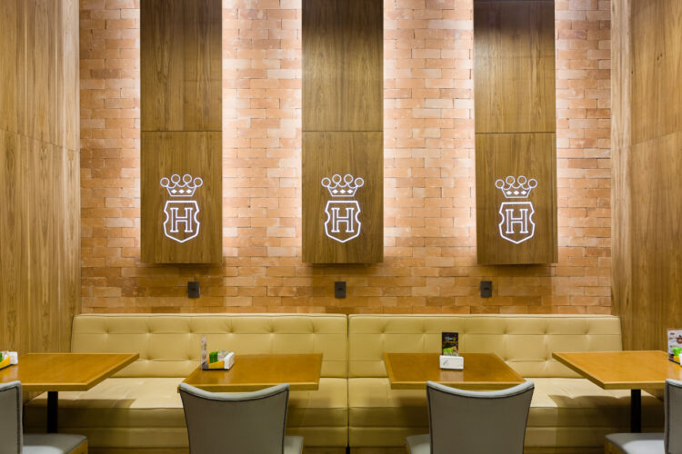
Concept store for the beginning of the expansion of the Argentine product’s chain. The design highlights the main elements of the brand. The golden yellow and the crown of the logo are used in harmony with the wooden elements, handcrafted bricks and warm color palette.
Retrofit and transformation of a former factory into a shopping center. Respecting the memory of the original construction built in in 1939, in São Paulo’s traditional neighborhood of Mooca, with an implantation that allows urban fluidity. The new constructions receive a modern language, harmonizing the new with the preserved, transforming the space in a meeting point for the neighborhood.
Learn more about us on our about page or on our instagram.
